Invitation Maker & Card Design
- 3.8
- Rating
- 10.00M
- Installs
- Free
- Price

 Analysis by App-foxy
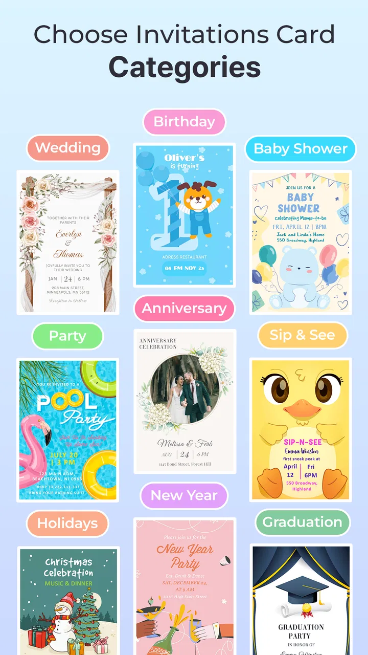
When I need a good-looking invitation quickly, I usually do not want to open a full design suite, search for the right canvas size, and spend an evening adjusting every element. I want something that helps me move from a rough idea to a card I can actually send. Invitation Maker & Card Design is built around that exact situation. It is a free art and design app from Maxlabs Graphic Design Tools, focused on making invitations for occasions such as weddings, birthdays, and RSVP events.
After using it, my impression is that it works best as a practical shortcut rather than a replacement for professional design software. The app gives you a starting point, lets you shape the message and visual style, and is aimed at people who need a polished result without already knowing how to design. That makes it especially useful when the event is close, the guest list is still changing, or the person organizing it is not comfortable with complicated creative tools.
Its audience is broad: the content rating is Everyone, it runs on Android devices using version 6.0 or later, and it is free to install. The current version is 2.0.5. The app has reached over ten million installs and holds a 4.2 average from around twenty-one thousand ratings, which suggests that the basic invitation-making workflow is useful to a large number of people. Optional in-app purchases range from $2.99 to $39.99 per item, so I would approach the free experience as a way to test the workflow before deciding whether extra content is worth paying for.
You May Also Like

 Blood Strike: 2.5 Anniversary
Blood Strike’s Loadouts Turn Every Drop Into a Tactical Gamble
A close look at Blood Strike’s custom loadouts: how fast access to signature weapons reshapes its battle royale rhythm, rewards preparation, and narrows the gap between fights.

 Pandora - Music & Podcasts
Pandora’s Music Is Easy to Start, but Harder to Recover
Pandora’s strength is its low-effort path from a seed to a station. Its weak spot is how much confidence it asks you to place in connection, setup, and quiet recovery.

 8 Ball Pool
 Is Built on Rivalries, Rematches, and Routine
A close look at the rivalries, rematches, shared routines, and unanswered safety questions that turn a quick pool match into a persistent mobile community.

 Samsung Music
’s Quiet Strength Is Playing What You Already Own
Its reach comes less from spectacle than from dependable access to a personal library. That simplicity is both the app’s strongest retention engine and its ceiling.

 AccuWeather: Weather Radar
AccuWeather Review: A Quick, Clear Forecast for Everyday Decisions
For everyday plans, the best forecast is the one you can understand quickly. AccuWeather makes rain timing, radar, and local conditions easy to act on, with a few trade-offs.

 Hill Climb Racing
Why Hill Climb Racing Still Turns Crashes Into One More Run
A tiny car, a bumpy hill and one more upgrade: Hill Climb Racing keeps resurfacing because its simple chaos makes every near-miss feel personal.
More From Our News Desk



From a rough event idea to a finished invitation
I find the easiest way to get value from an invitation maker is to settle the event’s essential details before thinking about decoration. This section follows that practical path, from choosing a visual starting point to checking how the finished card will read when someone sees it quickly on a phone.
Starting with the real problem: what must the card communicate?
The most important first step is not choosing a decorative style. It is deciding what the recipient needs to understand immediately. For a birthday invitation, that usually means the person being celebrated, the date, the time, the location, and a clear response request. For a wedding, the card may need a more formal tone and more careful spacing because names, ceremony details, reception information, and RSVP instructions all compete for attention.
I found that the app makes more sense when I treat it as a communication tool first and an art tool second. Before opening a template, I would write the essential information in a short note. This prevents a common mistake: selecting a beautiful layout and then forcing too much text into a space that was designed for a brief message. The template should support the information, not dictate the event details.
The built-in focus on invitations gives the app an advantage over a general drawing application. In a blank design program, I would have to decide the canvas, hierarchy, alignment, and visual theme myself. Here, the invitation context narrows those decisions. That is helpful for a parent preparing a child’s party, a couple sharing a save-the-date style announcement, or someone organizing a small gathering after work.
Choosing a template without losing the event’s personality
The template stage is where the app saves the most time. Instead of beginning with an empty page, I can start from a visual arrangement that already suggests where the headline, supporting text, and decorative elements belong. That does not mean every template will fit every event. A formal wedding invitation can feel wrong if it uses a playful birthday-oriented look, while a child’s party can become unnecessarily stiff if the design is too restrained.
My advice is to choose based on the mood of the event and the amount of information, not just on the most attractive preview. A design with generous empty space is usually easier to adapt when the location name is long or when RSVP instructions need an extra line. A more decorative template may look impressive at first but leave less room for practical details. This is one of the app’s less obvious trade-offs: the most visually elaborate starting point is not always the easiest one to finish.
I would also make the main message readable before worrying about small decorative touches. If the invitation is going to be viewed on a phone, people should be able to identify the occasion and date without zooming. This matters particularly for group messages, where recipients may glance at the image quickly. A template can provide a strong visual foundation, but the final quality still depends on whether the important information remains easy to scan.
Editing the message as a handoff between design and logistics
This is the point where a creative task becomes an organizational one. The person designing the card may not be the person who supplied the address, confirmed the start time, or will collect replies. I recommend treating the editable text as a checklist. Read every line slowly and compare it with the event plan before sharing the result.
That simple handoff catches mistakes that are easy to miss when concentrating on colors and arrangement. Check the weekday as well as the date, confirm that the location is written consistently, and make sure the RSVP instruction tells people what action to take. If another family member or colleague is involved, send them a draft for review before the invitation goes to the full group. The app can help you create the card, but it cannot replace that human confirmation step.
For a birthday scenario, I would prepare the wording outside the app, create a first version, and then show it to the person who knows the guest list best. They may notice that younger guests need a parent contact, that the venue has a different entrance, or that the requested reply deadline is too vague. This workflow is more reliable than trying to remember every detail while styling the invitation.
Building a useful RSVP message instead of a decorative afterthought
RSVP information deserves special attention because it determines what happens after the card is delivered. A vague line such as “Let us know” may leave guests wondering whether they should reply by message, call, or another method. The invitation should make the expected response clear and keep the wording short enough to fit comfortably in the layout.
I see the app as particularly useful for events where the invitation image will be passed between people. A clear RSVP line survives that handoff better than a design that relies on the original sender’s explanation. If a guest forwards the image to a partner or parent, the card should still contain the essential context. This is a practical reason to avoid filling the lower part of the design with unnecessary decoration.
There is also a useful distinction between an invitation and an information sheet. If the event has many instructions, parking details, menu choices, or multiple activities, forcing everything into one card can make it hard to read. In that situation, I would use the app for the attractive summary and provide longer instructions separately. The invitation should open the conversation, not carry every operational detail.
Reviewing the card before it leaves the app
Before sharing, I would inspect the design at the size at which recipients are likely to see it. A card can look balanced while editing and become difficult to read when viewed as a small image in a messaging app. I would look for crowded lines, awkward breaks, low contrast, and decorative details that compete with the date or location.
I would also read the invitation aloud. This sounds basic, but it reveals missing words and unnatural phrasing quickly. Reading aloud is especially helpful when the design uses a short headline followed by several separate text areas. The eye may treat those areas as decoration during editing, while the recipient experiences them as one message.
Another useful check is to ask someone unfamiliar with the event what they think the card says. If they cannot identify the occasion, date, or response method within a few seconds, the layout needs another pass. This is a stronger test than asking the organizer, who already knows the information and may unconsciously fill in gaps.
Sharing the result and managing the next handoff
Once the card is ready, the next challenge is not design but distribution. You may send it to a family group, pass it to a co-organizer, or use it as a visual announcement alongside a written message. I would keep the accompanying text separate and direct. The image can provide the visual invitation, while the message can explain anything that does not belong on the card.
This separation makes later changes easier. If the venue changes, the time moves, or the RSVP contact is replaced, you can revise the card without turning it into a crowded noticeboard. It also reduces the temptation to add every possible detail simply because there is still a little empty space in the design.
For a workplace gathering, the handoff may involve one person creating the card and another person distributing it. In that case, I would send the editable or final version with a short note identifying the confirmed details and any information that should not be changed. The app supports the production of the visual asset, but a clear internal handoff prevents accidental edits and inconsistent versions.
What the finished result does well
The strongest outcome is speed with a presentable appearance. Someone who would normally struggle to create a balanced invitation can begin with a relevant visual structure and concentrate on the wording. That is a meaningful benefit for personal events, especially when the goal is to make something warmer and more personal than a plain text message without spending hours learning design principles.
The app also fits occasions where the invitation needs a distinct mood. A birthday card can feel more celebratory than a calendar reminder, while a wedding-related card can communicate a more considered tone. The value is not only visual polish; it is the ability to make the announcement feel intentional.
Compared with a general-purpose design app, this focused approach reduces the number of decisions at the beginning. Compared with a word processor or a basic photo editor, it is better suited to arranging an invitation as a complete visual composition. The trade-off is flexibility. A professional design tool will usually give an experienced user finer control over typography, custom layouts, brand rules, and complex revisions. Invitation Maker & Card Design is more appealing when convenience matters more than complete control.
I would recommend it to people who want a quick first draft, families preparing event announcements, and users who prefer guided design over a blank canvas. It is also a sensible option for occasional creators who do not want to learn a large creative suite for one wedding-related card or a single birthday party.
Where the workflow breaks down
The app is less suitable when the invitation is part of a larger visual identity. A business event, a formal organization, or a designer working from strict brand guidelines may need precise control that a template-first workflow does not prioritize. In those cases, a dedicated design application is likely the better choice, even if it takes longer to use.
It can also become frustrating when the event requires unusually long wording. Templates are helpful only while the content fits their intended structure. Once the card needs several paragraphs, detailed directions, dietary questions, or multiple response options, readability becomes the limiting factor. I would rather create a concise invitation in this app and put the extended information in a separate message than force the design to carry too much.
The free entry point is useful, but the presence of optional purchases means I would check the available choices before committing to a particular visual approach. If the style you want depends on paid content, the time saved by starting with a template may be reduced by the need to reconsider the design. That does not make the app a poor value, but it is a reason to decide early whether the free selection is enough for your event.
Another limitation is that a template can make different events look somewhat similar if you do not personalize the wording and visual choices carefully. I would change the message thoughtfully, keep the details relevant, and avoid adding decorations just to make the card feel unique. A simple invitation with clear information often works better than a busy one that resembles a generic event graphic.
Who should install it, and who should choose something else?
I would install Invitation Maker & Card Design if I needed a shareable invitation soon and wanted more personality than plain text. It is a good fit for a parent organizing a party, a couple preparing a wedding announcement, or a friend coordinating a gathering where the invitation needs to look finished without becoming a design project.
I would skip it in favor of a more advanced design tool if I needed exact typographic control, a completely original composition, or a reusable professional identity across many materials. I would also choose a simpler method if the event information changes constantly and the invitation is mainly being used as a temporary notice. In that case, a text message or calendar event may be easier to update than a graphic.
For most casual occasions, though, the app reaches a useful middle ground. It is faster than designing from scratch and more expressive than sending plain logistics. Its average of 4.2, large install base, and free starting price make it easy to try without much commitment, while the Everyone rating keeps it approachable for a wide range of users.
My final advice is to begin with the information, choose a template that leaves room for it, and treat the finished card as one step in a larger communication workflow. The best result comes from using the app to clarify an event, not merely to decorate it. If you keep the wording concise, review every detail, and plan the handoff to whoever will distribute or manage replies, Invitation Maker & Card Design can turn a rushed announcement into an invitation that feels deliberate and genuinely personal.
FAQs for Invitation Maker & Card Design
01What features does Invitation Maker & Card Design offer?
Invitation Maker & Card Design offers a variety of features including customizable templates, a wide range of design elements, and easy-to-use editing tools. Users can personalize invitations with text, images, and colors to suit any occasion, such as weddings, birthdays, or corporate events. The app also provides options for digital sharing and printing.
02Is Invitation Maker & Card Design suitable for beginners?
Yes, Invitation Maker & Card Design is designed with user-friendliness in mind, making it ideal for beginners. The app features an intuitive interface with drag-and-drop functionality, allowing users to create professional-looking invitations without any prior design experience. Tutorials and guides are also available to assist new users.
03Does the app require an internet connection to function?
While an internet connection is needed for downloading the app and accessing certain online resources, most of the design features in Invitation Maker & Card Design can be used offline. This allows users to work on their projects without interruption and then share or print their invitations once they are back online.
04Are there in-app purchases in Invitation Maker & Card Design?
Yes, Invitation Maker & Card Design offers in-app purchases. While the app provides a range of free templates and design elements, users can purchase additional premium templates and features to enhance their projects. These purchases are optional and are designed to offer more variety and customization options.
05Can I share my invitations directly from the app?
Absolutely, Invitation Maker & Card Design allows users to share their creations directly from the app. Once your invitation is ready, you can send it via email, social media, or messaging apps. The app also supports saving your designs as high-quality images or PDFs for printing or future use.
Pros
- User-friendly interface for quick card creation.
- Wide variety of templates for different occasions.
- Customizable fonts and colors enhance creativity.
- Seamless sharing options via email and social media.
- No watermark on exported designs in premium version.
Cons
- Limited templates in free version.
- Occasional ads can interrupt design process.
- Some features require in-app purchases.
- Limited support for non-English languages.
- App may lag on older devices.

Invitation Maker & Card Design
Gallery